10 Fun and Modern Brochure Designs
There are three important things to consider in a brochure design — layout, font style and color. It is vital to plan the layout of brochures to ensure that the information, images and other details won’t crowd on single space. Planning this will also help maximize the spaces and folds of brochures. Designers should also achieve balance in pictures and text on a single page.
Font style is equally important because it will determine how readable the data in the brochures are. It advisable to use basic font styles like the ones under Sans-Serif family. These are simple and the letters are clearly distinguishable from one another. However, designers should also consider using fancy and playful fonts on brochure covers to catch attention of readers and establish brand identity.Usually, maximum of three different styles are used on a single print — the lesser the better.
Thirdly, colors bring life to brochures. Different hues enhance fonts and layout design and make prints attractive to readers. It is more fun and encouraging to read full-color brochures than plain black and white text. Colors also determine the quality of paper and brochure printing used. Thin or low quality paper can’t hold too much ink that composes various colored prints.
Below are 10 design examples of modern, fun-looking brochures for your inspiration:
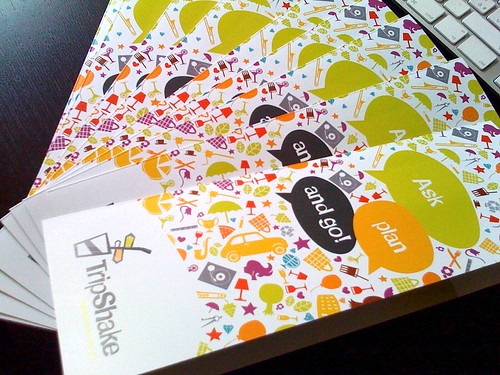
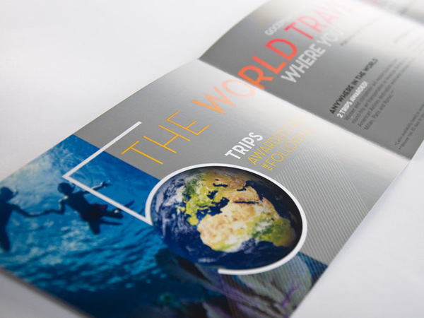
Brand new TripShake brochure
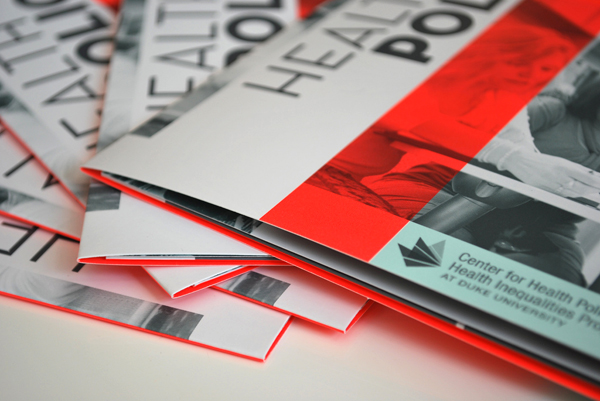
CHP Brochure
Museum Mile | Folding brochure (A)
SEGD Brochure
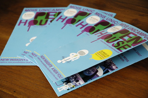
mdis open house brochure
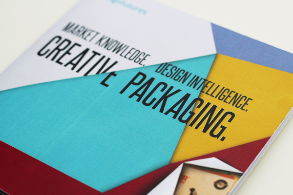
redcow creative
Raffle Brochure
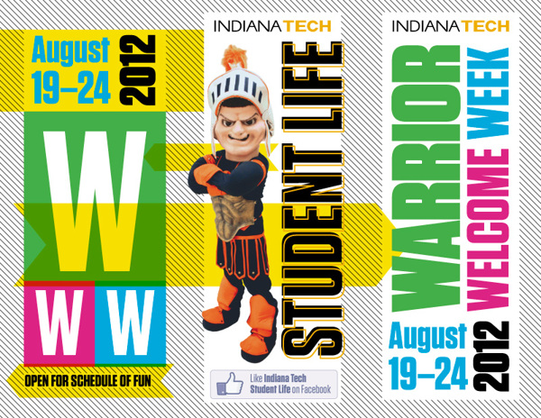
2012 Warrior Welcome Week
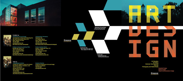
Art & Design Brochure
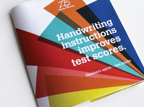
Zaner-Blosner Brochure
There are countless ways to come up with your own brochure. Create a layout that will best represent your business, event or cause. Choose elements —font styles and hues — well to come up with remarkable brochure designs. Use colors that are significant to your brand and can impress your target market.

