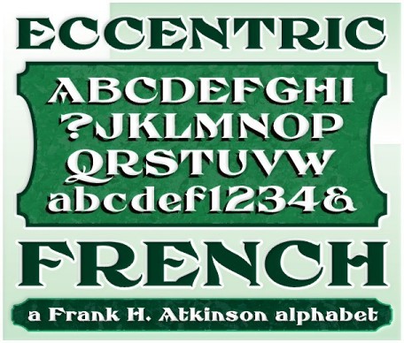
The curves are vintage and the serifs are big. They’re so big that for years I never had the courage to tackle this intimidating font. But when fellow signmaker Frank Smith laid the groundwork for this intriguing typeface by Frank H. Atkinson, I couldn’t pass on the opportunity to take it from paper to keyboard. After all, at over 100 years old, I felt this alphabet had never been given a proper, digital treatment.
So how did this face survive the last century? Well, for those who don’t know the history, it survived in Atkinson’s ubiquitous book, Sign Painting, published first in 1908, the generational standard for anyone interested in sign-related type design. The layouts and lettering treatments in this book have influenced countLess designers for more than a hundred years, but most haunting to me was this strange face with the big serifs.
Well, I’m haunted no more. The work is done, the kerning is complete, and nothing but a mouse-click separates a very old idea from the modern world.
It’s wide, it’s big, and with those crazy serifs, it is definitely eccentric-!!!

