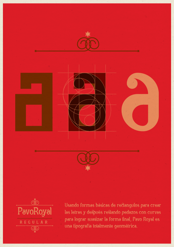
Pavo Royal is an experiment. As a typography fan—not a typographer— I have always wanted to design a typeface but didn’t know what to do when the programing part came and all the “complicated” stuff that goes along with it. So this is my first typeface (of many I hope). I made it to be a display type but i think it works fine in copy.
The basic form of each glyph was made with rectangles and then I substracted parts using circles to smooth it. It has standard and discretionary ligatures and because of its irregular counterforms, in smaller sizes it has a woodtype feel to it (the way I see it).

