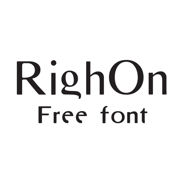
Times New Roman in Greek writing are too boring typefaces and every one seems to avoid them either their history in typography in European languages. I have to admit I was going on something newer than New Roman and I started chopping and cutting to fix all these years of snob by graphic designers.
My goal while attempting to redesign was to have a contemporary one without loosing the double weight curved shape of each typeface as final result. After all it looks smoother and it’s OK with me.

